Windows Phone has moved on from it's 7 origins, traveled on past 7.5, and even 7.8, and is now fully embedded into 8. That's a few new versions of Microsoft's mobile software, and with each new iteration Microsoft has managed to make Windows Phone a bit more enjoyable. A bit more desired. With the switch to Windows Phone 8, though, there were plenty of other things to get excited about for anyone who has already jumped into the Microsoft waters, or even plans to.
Windows Phone 8 wasn't so much about the mobile platform by itself, but how it connects to everything else in the Microsoft stable. Windows Phone 8, Windows 8, and Microsoft's entertainment box, the Xbox 360 (and soon to be Xbox One), are all inter-connected by things like the Cloud, and other services. It's about the whole experience for Microsoft.
As long as you're whole house, or even multiple rooms, are all part of the same ecosystem.
But that's not anything new, obviously. Samsung's got features in its phones that only work for other Samsung phones. And then there's Apple, which has no qualms about trying to get your whole house under the Apple banner. That's what Microsoft wants, and with Windows Phone 8 they got a little bit closer to that goal.
Of course, there are still features missing from Windows Phone. Last May I asked all of you how you would change Microsoft's Windows Phone notification system, and a lot of you had plenty of good ideas. Most of you pointed out that just a notification center-type thing would be a good idea. And that is a good idea. Microsoft's Live Tiles are great, and they get a bonus for being a fresh idea in the mobile market, but it's not a surefire way to get all your notifications. If you have an app installed, but you don't put a Live Tile up on the Start screen, well, you'd never know beyond an initial Toast notification that the app was trying to get your attention.
Microsoft made it clear that they had been working on a notification center-like experience, but that the feature couldn't make it to the initial launch of Windows Phone 8. They were still working on it, though, and when the time came for them to show off the finished product, they'd do it. I think we all should have expected that unveiling to wait for the next major upgrade to the Windows Phone software, though. Officially, anyway.
There will probably be a new upgrade to Windows Phone later this year. And with it, new features. A notification center is more than likely going to be one of those new features. I'd be surprised if it wasn't there. And sure enough, earlier this morning, a leak showcasing what Microsoft's notification center will look like began to make the rounds on the Internet.
However, I need to make clear that this isn't official. The is a rumor amongst rumors. And I'll be the first one to tell you right now that I really, really hope Microsoft changes the way it looks, if it is indeed real. It's so bland, it's remarkably boring to look at. Right now, as I'm looking at it, I don't have any desire to use that notification center. Not even a little bit.
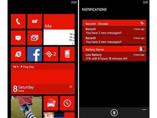
But, let's go ahead and assume that this particular notification center for Windows Phone is indeed real. As our own Alex Wagner pointed out in his initial report for the leak, the notification center is accessed by touching the Tile right next to the stock Messages Live Tile. As you can see from the image above, the application "Baconit" has two separate notifications, which you can see inside the notification center. On the screen shot to the left, you can see that the "Baconit" Live Tile shows two notifications waiting.
And yet, that "notification center" Tile doesn't show anything. The more I look at it, the more I'm assuming that the BlackBerry-like star icon may be present to show that there are notifications waiting, maybe? Either that, or these leaked images are meant to show that the notification center Tile isn't a Live Tile. It's just there.
What I think is funny is that this notification center Tile is right next to the "Me" Live Tile, and I think right there shows what's wrong with this idea. For one, just throwing a Tile at the screen and calling it a notification center doesn't add to the experience. Especially if it isn't a Live Tile. That actually contradicts the whole idea of the Start screen, by adding a Tile that doesn't do anything to let you look at it with a glance. Furthermore, why on Earth would you not just include the notification center function in the "Me" section of the phone?
You could just have the "Notification Center" be a couple swipes (or, if you ask me, it would be the first thing that popped up) in the "Me" area. No additional Tiles, or hanging your hopes on another Live Tile and calling it good. Actually bake it in, Microsoft. The "Me" area of Windows Phone is a good idea, so just expand on that.
It just makes sense to have the notification center in that area.
What do you think of the Windows Phone notification center leak? Do you think it will finally give Microsoft's mobile platform one step closer to the competition? Or do these leaks make you think Microsoft has a bit more work to do? Let me know!