I've written a few articles now outlining the point that I think that Apple needs to make a change in their interface sometime soon in order to continue their current success. I often mention in these same posts that BlackBerry went down a similar road to meet a dim fate - and now they're making a change. Even if I'm not head-over-heels for the new design, I do applaud them for their efforts and I'm interested to see if it actually pulls through for them.
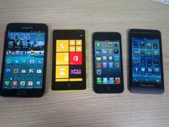
When I read Alex's article about the BlackBerry 10 L-Series being spotted in the wild and being released sometime next year (an event is scheduled for January 30th of 2013, and BlackBerry announces that the line will be available sometime shortly after the event) I saw the picture that has been leaked comparing one of the devices to similar smartphones. Phones like the Galaxy Note II, Lumia 820, and the iPhone 5 are pictured with the latest BlackBerry addition and I have to say... at first glance, this BlackBerry looks strikingly similar to the iPhone 5.
Maybe it's the fact that they're pictured right next to each other, or the similar blue backgrounds and square icon formation. Regardless, when I first looked at the picture I had to search for the BlackBerry device in the photo like a geeky watered down game of Where's Waldo. You can even see from the notification bar at the top that the similarities are uncanny to the iPhone's interface - something I'm sure we'll be hearing about later in regards to Apple and their notorious lawsuits. I'll post the picture here below so you can see what I'm talking about:

I mentioned in my article before that I thought BlackBerry did a good job of making the new interface "their own", but at the same time I had not seen a side-by-side comparison with any other models. Honestly, the only phone I see in that picture that really carries it's own is the Nokia Lumia 820 with Windows Phone 8. The others show similarities, but none as close as the iPhone 5 and the new BlackBerry 10 L-Series device.
Although I feel that BlackBerry made the right move by switching their attention away from their famous candybar QWERTY design to something more modern, they probably could have done a better job of making BlackBerry 10 more unique in looks and feel. Showing in this device in particular, I don't see any buttons on the front plate of the hardware. I'm not a big fan of phones who don't have physical or capacitive buttons on the front and simply have the menu keys on the screen and in the software itself. I'm not sure why it bothers me, but it does. So combining that with the fact that it looks so similar to iOS, in my opinion, already deters me a little bit. I am still interested to see how it actually feels and works in the hand, though. No final judgements until I do.
Do I think that BlackBerry/RIM is too late to make a comeback? I never think it's too late for any person or company to make an innovative idea that works. It's kind of like when a popular band makes a fantastic album, you love it, and the next album flops and you're super disappointed. Then they make another album and another and they all miserably fail. You forget all about them. Then, during their 10 year reuinion they reminisce about the old times and they break out their instruments and have an old fashioned jam session and come up with the greatest and best song in the world! Manufacturers can do something similar, if they wanted, but from the looks I don't think this particular BlackBerry upgrade is what's going to bring the company back in the public's good graces.
So readers, what do you think about the new BlackBerry L-10 line? Are you interested in switching back to BlackBerry, or are you happy with what you have now?
Image via UberGizmo