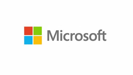
Microsoft has already introduced a new Windows logo for Windows 8 and Windows Phone 8, but today the company also took the wraps off of a shiny new logo for the company itself. This is the Microsoft's first new logo in 25 years. In a post on its official blog, the Redmond-based firm explained that the logo "takes its inspiration from our product design principles while drawing upon the heritage of our brand values, fonts and colors." Microsoft says that the font used in the logo is Segoe and that the colored squares are meant to represent its "diverse portfolio of products."
This new Microsoft logo is somewhat reminiscent of the new Windows 8 logo in that they both feature four flat squares, but the squares in the Microsoft company logo aren't angled like the ones in the Windows logo, and as I mentioned before, they're also multicolored to represent Microsoft's various products. The squares are also similar to the look of the new interface in Windows 8 and the live tiles of Windows Phone 8. Twenty-five years is a long time for a company to go without updating its logo, but with several new products on the way this fall that feature a new appearance, it looks like Microsoft felt that the time was right to finally give its logo a refresh. What do you all make of Microsoft's new logo?
Via The Verge, Microsoft blog
- Log in to post comments