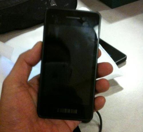
Very late into the night yesterday, images of what was reported to be a developer’s device for BlackBerry 10 began to make its way around the Internet. As the story started to develop, it didn’t take long before it was indeed confirmed that it was the real deal, and the device we were all looking at was going to be the handset that developers wanting to test their skills in BlackBerry 10 would be getting their hands on sooner, rather than later. But, the only thing I could take away from the image, wasn’t so much that I was getting excited about BlackBerry 10, but the fact that the device looked just about as uninspired as it gets.
First, let’s get one thing clear: this exact device won’t be the one that we are all sporting when BB 10 finally makes its way to retail shelves. This is purely for developers, and while it’s cool to look at from that perspective, there’s no reason to get your hopes up that this is the device you’ll be showing off to all your friends.
With that said, I’m sincerely hoping that whatever Research In Motion does have planned for their first BlackBerry 10 devices doesn’t look anything like what we’re seeing above.
Why? Because it’s tired, and uninspired.
I completely understand that we’re in this strange time where we all want touchscreens, and we love our devices to have big, bold and beautiful displays with thin bodies. I get that. There’s nothing wrong with that. But, if you look at that developer’s device up there, you immediately think of a few things: one, an iPhone. Just look at the comments around the Internet. It looks like an iPhone, just without the Home button. Or, I’ve also seen people say it looks like a Galaxy S II by Samsung, and you know what? They’re not wrong. Because it does.
Those stylings are there, you can’t deny that. This particular developer’s device looks like an exact descendent from both of those aforementioned phones. Or, the weird and maligned offspring of a night gone wrong. Either way, even if it is just a developer’s device, it goes to show that RIM thought it was necessary, or even right, to make a device that looks so strikingly like Apple’s and Samsung’s creations.
Have we reached a point where there’s no real point to creating something? No real desire to do something new, and different? The most “unique” looking slab device I’ve seen recently is from Motorola with their RAZR series. Those corners make it stand out, even if you’re still just looking at a thin device with a big display. Motorola has a device that stands out.
We’ve got the Next Galaxy right around the corner from Samsung, and despite the fact that we’ve seen plenty of rumors and leaks reportedly telling us what it will look like, we still don’t know officially. There’s still a chance that Samsung plans on blowing everyone’s mind with a brand new, unique and tantalizing hardware design.
Or, they could release a phone with a big display and rounded corners. Either way.
I really do hope that we aren’t in a rut here. It doesn’t help that HTC is getting rid of QWERTY keyboards altogether. But it is what it is. RIM, here’s your chance later this year to completely surprise everyone, not just with your new and improved software, but also with your hardware. Stun the world. Surprise us.
Please.