Out of all the tablets we have managed to review here at PhoneDog, the Amazon Kindle Fire is easily the most unique. It straddles the line between tablet and eReader and brings a previously unmatched level of content to the Android platform. Priced at the comparatively low price of $199.99 and released right before the busiest shopping weekend of the year, Amazon was clearly targeting shoppers who wanted tablets but were on a tight budget, while trying to scoop up some of that tablet market share from Apple in the process.
Although the device is allegedly selling below cost, Amazon did not pull any punches with the Kindle Fire. It may not be the most powerful tablet to date or even the thinnest, lightest or best looking piece of hardware. But the Fire packs a nice little punch for the money you can save. It ships with a 1GHz dual-core processor, 512MB RAM, a 7-inch (1024 by 600 pixels) IPS LCD display and 8GB built-in memory supplemented by 5GB of free cloud storage, the Fire can certainly hold its own. But is it the tablet to have this holiday season? Or should you purchase something with a little more oomph?

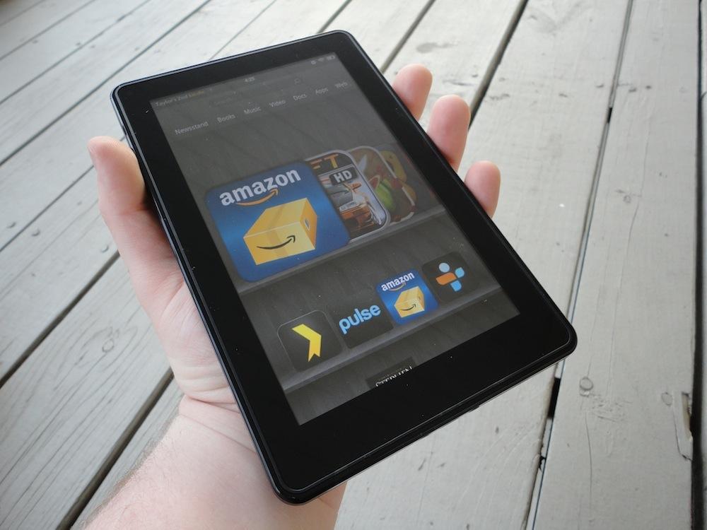
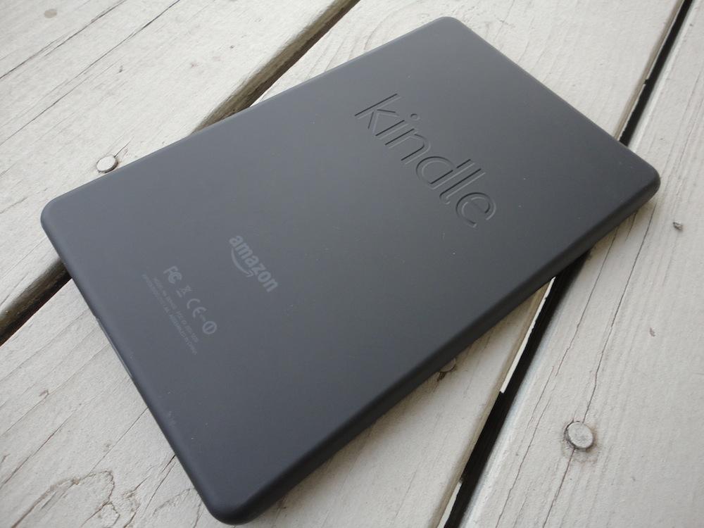
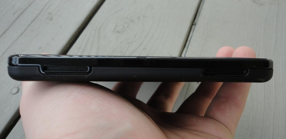
The first thing you will notice about the Kindle Fire upon holding it in your hand is just how heavy the device is. It's not necessarily a bad thing, though, as it gives off an air of sturdiness and durability. The Kindle fire is built extremely well, which actually surprised me after I ripped through the hassle-free, eco-friendly packaging. Other than weight, you might also notice how similar the design of the Fire is to the BlackBerry PlayBook. The face of the Fire sports a 7-inch IPS LCD display with a resolution of 1024 by 600 pixels. There are no physical or capacitive buttons on the face of the device. Along the top edge, you will find two loud speakers. The right and left edges of the device are smooth and barren, while the bottom edge encases a 3.5mm headphone jack, a microUSB port and the power button. The back of the device is a matte finished, rubberized plastic which adds to the allure of sturdiness and ensures a nice grip. The only branding found on the Fire is the typical inset "kindle" logo around back, placed above a flush Amazon insignia.
Although the Kindle Fire is built remarkably well, I do have my gripes. The placement of the power button, in typical Amazon fashion, is along the bottom edge of the device. Countless times while using it and propping it on my leg or on a tablet in portrait, I would accidentally depress the button, resulting in the device entering standby and interrupting anything I was doing at the time. Aside from that, there are no other physical buttons – no menu, back, home, search or volume buttons. I had some trouble with the soft buttons, which I will touch on below. I don't mind a device sans buttons. I actually enjoy most buttonless Honeycomb tablets. However, if nothing else, there should be a physical volume rocker. On top of this, Amazon cut some corners, some that I may have a hard time dealing with down the road. There is no Bluetooth radio in the Kindle Fire, which means I can never pair it with the Bluetooth keyboard I use with my Galaxy Tab so much. And there is no expandable memory slot.
One of my original concerns with the Kindle Fire was the actual size of it. But I found out that it fits into the pocket of my favorite coat with relative ease. That was enough to win me over, as I hate having to carry my Galaxy Tab everywhere I go. Overall, I've been surprised and relatively impressed by the quality of hardware for such an affordable device.

Despite the fact that the Kindle Fire is powered by Google's Android software, one of the main things you will not hear when people are talking about the Fire, is mention of Android. This is because the Fire's interface looks nothing like Android at all. It has been completely themed, from top to bottom, and removes all the unnecessary clutter from your home screen. There are no widgets, no shortcuts, no wallpapers or even separate home screens to be found on the Kindle Fire. It did take me a few minutes to get the hang of the interface; there are a few quirks to how it works, like the Amazon Appstore application not even having an icon. Instead, to get to it, you must navigate to the Apps tab from the home carousel view and tap "Store" in the top right corner. Other than a few hidden-in-plain-view features, the carousel interface is refreshing, very snappy – almost too snappy at times. I found myself overshooting my destination quite often – and is beginning to grow on me.
The Kindle Fire is not officially a Google-supported device. This tablet was Amazon's own initiative and they did not comply with Google's Android Update Alliance guidelines; therefore, the Kindle Fire will never officially support Android Market or any of Google's apps or services. It may never be current in terms of software either. The Fire currently runs Android 2.3, which isn't even optimized for tablets. This, however, has finally revealed why Amazon was working so diligently on creating their own application store for Android devices. They have successfully created their own ecosystem within the Android community. To purchase applications for your Fire, you must go to Amazon's Appstore. You can also access Amazon Prime Instant Videos, your Kindle library, any music you might have purchased through Amazon and even magazine subscriptions. Instead of making an Android tablet, Amazon has successfully created an Amazon tablet which is a perfect way for customers to tap into the services they were already paying for ... and to suck in new subscribers (which is why Amazon doesn't mind selling these things below cost).
The display, while color reproduction and contrast are great, is nothing to write home about. There is noticeable grain with only 169ppi. The display is fairly bright, too. If you have bought this thing mainly for reading, though, the display will be a serious low point. Visibility in direct sunlight pales in comparison to its Kindle brothers. Then again, you can read in low light settings without a lamp. I guess you could look at it as an even trade-off, depending on when and where you like to read.
Powered by a 1GHz TI OMAP dual-core processor, the Fire is very snappy. I have yet to encounter any lag whatsoever. Some people were commenting on my First Impressions, saying that they had experienced a bit of lag, but personally, I have not. I feel the Fire could have come equipped with a bit more RAM than 512MB, but that's just me being greedy. There is no true multitasking on the Fire (you can still play music in the background while running other applications), and I feel that is to avoid any lag, even from power users.

During the Fire announcement, Jeff Bezos took some time to introduce their new Silk Browser for the Fire instead of the built-in browser from Android. It was promised that the Silk Browser would be extremely fast and smooth. Web pages do not actually render on the device. Instead, with Silk Browser, they are rendered on Amazon's servers and the resulting web page is sent to your device as a condensed package. The idea is to speed up web page rendering while preserving that all-important battery life. In short, this is all great ... in theory. But it has been choppy and slow in my use. My iPhone and Galaxy Tab consistently loaded pages (all on the same Wi-Fi network and with cleared cache) faster than the Fire. 'Tis a sad day for those of us who were really looking forward to the Silk Browser and here's to hoping it will get better with time.
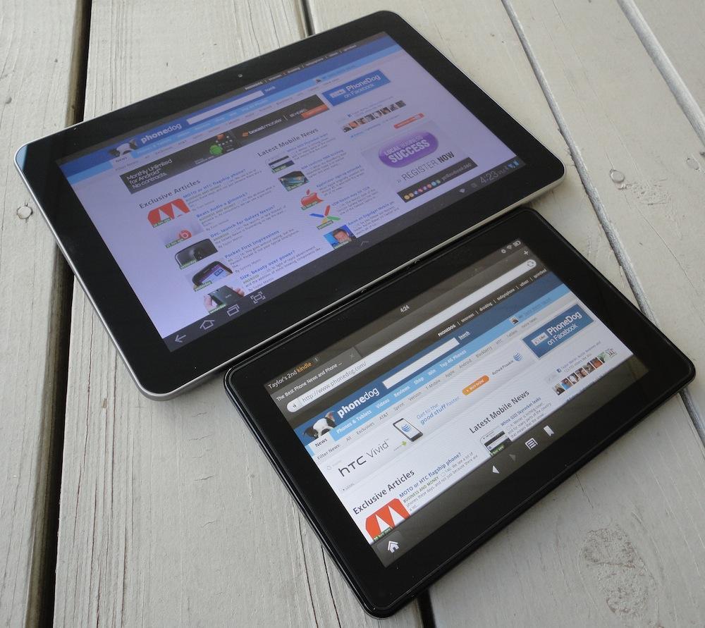
I was originally really worried about display size. I bought the original Galaxy Tab and have toyed around with a few PlayBooks in my day. I loved the 7-inch form factor ... that is, until I used my first 10.1-inch Android tablet. I was afraid making the jump back to a smaller device might be tough and unpleasing. But after a few days of playing with the Fire and using it to watch television episodes via Prime Instant Video and some light web browsing, I'm enjoying it more than I thought I would. There are some obvious drawbacks to having a smaller display, like less room to type and more panning in the web browser, but it honestly hasn't been too bad. It definitely makes reading on my Galaxy Tab seem ludicrous, too, as I can easily palm the Fire with one hand.
One of the major gripes I've been reading about has been the lack of a camera on the Fire. Personally, I don't see this as a problem. Sure, every tablet I've owned in the past two years, save for the original iPad, has come with a pair of cameras, but I cannot recall a single time I've used them other than video calling, which I can count the number of video calls I've made via tablet on one hand. I don't see the need for cameras and am more or less indifferent about the Fire not having one.
Content has been a low point for Android tablets since day one. I hate to make the comparison, but when you look at what is available for the iPad versus what is available on Android, the iOS tablet simply has more content, whether it be RSS readers, streaming media support, etc. Amazon shortens that gap with Prime Instant Videos, Newsstand, and their own app, book, web and music stores. There were also several launch partners like Hulu, Netflix, Zinio and more that gave the Fire a slew of non-Amazon content out of the gates. If you're looking for access to mobile media for cheap, the Fire just might be the tablet for you.

Being primarily a media consumption device, the speakers are fairly important. And the Kindle Fire's speakers are a hit or miss. While streaming music, the speakers are great. They're crisp and clear, and they're definitely plenty loud. So what's the problem? Location. They're fine while you're holding the device in portrait mode. But upon activating a video or game, the interface switches to landscape, regardless of the actual orientation of the device. This forces the user to rotate the tablet, and it moves the speakers to the left side, making it extremely unbalanced to the person holding it. To be able to watch an Instant Video with any sense of audible comfort, I had to plug my headphones in. It's not a huge deal, but it seems as if the placement of the speakers was an afterthought.
These days, with a new product typically comes bugs. The Kindle Fire is no exception to the rule. Many users have reported issues with Wi-Fi connectivity. Some cannot even connect to a wireless network at all, others are getting spotty reception and some are up in arms over the Wi-Fi connection cutting off after the display is turned off. Personally, I've only experienced the latter, and it's only a problem with streaming music while the display is off. That said, I have noticed that the problem, in my case, at least, is isolated to applications that I have side-loaded, like Spotify. This doesn't happen with Pandora or TuneIn Radio, which I downloaded directly from Amazon's Appstore.
Over the past several days, I have put the battery through some more in-depth testing since my First Impressions. I'm not blown away, by any means. But the battery life is as good, if not better, than Amazon has claimed. In use, the battery drains fairly quickly, as expected; if you're using this thing, you're likely going to consume a lot of power, as it is a device heavily driven by its content. But when the display is off and the device is in standby mode, the battery slowly trickle-drains. After a full 24 hours without me touching it, the battery dropped from 100 to 90 percent. After watching an entire hour episode of a TV show on Instant Video, the battery only dropped from 70 to 59 percent. Not bad at all.
As I promised, I will revisit the issue of soft buttons. I don't fault Amazon for deciding to go without physical navigation buttons on the Fire; it makes sense. They were trying to cut costs every step of the way. That said, they could have executed their soft buttons a little better. The soft volume control isn't all that bad. I have to wake the device up to change the volume when I'm streaming music, which is slightly annoying. But it's nothing to cry over. The soft navigation buttons, however, are a mess. Sometimes you will press them, they will give you a visual indicator that they have been pressed ... and nothing happens. It's not lag, as you can still navigate within the application you were in. But sometimes it requires two or three presses of the home button to return to the carousel. It's frustrating, to say the least.

If you're on a $200 budget, there is nothing out there quite as nice as the Kindle Fire. And it will be a great tablet for the family or anyone who was on the fence about buying a tablet in the first place. But for those die-hards, those who have owned tablets – like the iPad, or any other high-end Android tablet – before, may find the Fire a step in the wrong direction, even for $200. Nonetheless, it will make a great holiday gift for people of all ages.
I've thoroughly enjoyed the Kindle Fire since it arrived just the other day. It has its quirks and I have a few complaints (seriously Amazon, no volume rocker?). But for the money involved, the Fire is an exceptional product. I do fear, however, that once the new wears off, the Fire will begin to collect dust while I continue to use my Galaxy Tab. It may become my tablet designated strictly for taking with me in my coat pocket to events like Hockey games or concerts, when I can't carry a book bag.
What's Good: Good battery life; decent display; easily fits in most coat pockets and purses; no lack of content if you're an Amazon Prime user; extremely affordable in comparison to other tablets.
What's Bad: Not necessarily for power users or productivity; Wi-Fi connectivity problems; no Bluetooth; no expandable memory; power button placement leads to unintentional standby.
The Verdict: The Kindle Fire is a nice little tablet. Some have coined the term "mini-tablet." It is chock-full of content and all sorts of media that can be downloaded or streamed over Wi-Fi. To meet the low price of $200, some corners had to be cut, but there is nothing out there that quite matches what the Kindle has to offer for the same price. The Fire will make for a perfect gift for youngsters, parents and the in-between this holiday season.