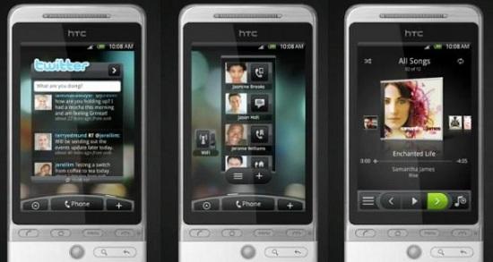
Before Android officially launched, Google was busy showcasing the new mobile operating system’s features. Multitasking, the ability to move widgets around your multiple home screens, and more multitasking. Great features, especially when put against the competition at the time, and it was one of the reasons why I got immediately excited about Android. When the original HTC Hero launched, the manufacturer showcased Sense UI, which was the natural evolution of TouchFLO and TouchFLO 3D. Sense UI was the next great thing for Android, showcasing the operating system’s easy customization, and new (much improved) visuals. Unfortunately for HTC, though, the original Sense UI looks exactly like the newest version of the software – and it’s getting long in the tooth.
For Android, diversity is one of the biggest draws to the mobile OS. (Some would say that it’s also one of its biggest detractors, but that’s for a different conversation.) If you look at a Motorola manufactured device, an LG handset, and an HTC-branded phone, the similarities are pretty slim. Sure, you can tell they’re Android, but the visuals are usually quite different. And that’s great. But, at the same time, there has to be a point where the look-and-feel of a user interface has to get boring. None of us like to be bored when we look at our phone, and if you’ve been an avid user of an HTC manufactured Android device, I’m seriously wondering how you aren’t bored.
Because let’s face it, Sense 3.5 is the same Sense UI that launched, with some new features. And yes, new features a great, everyone wants new things to use, but if it looks the same, how far does that really go? And yes, I’ll be the first to say that there have been some visual alterations here and there throughout the major (and minor) releases of the user interface, but on the large Sense looks the same. And I think it is time for Sense to make some huge changes to the UI.
The HTC Rezound has a lot of great features. It’s the first phone in the United States to feature Beats Audio Technology, and it’s got a gorgeous 4.3-inch 720p HD display. After I spent some time with the device, playing around with it in just a quick fashion, I can honestly say that the phone feels great in the hand, it’s incredibly fast thanks to that 1.5GHz dual-core processor, and it makes great usage of Android 2.3.4. But then there’s Sense 3.5, and I’m completely turned off. And let me be clear here, I love the new features that Sense has, like the lock screen in particular, but I honestly feel like I’m looking at a user interface I’ve been looking at since I bought my original HTC Hero.
For custom user interfaces, I know that when you’ve got a winner on your hand, you make sure that it keeps winning so people keep buying your handsets. And I will say that Sense UI is one of the best UIs out there, no doubt about it. But, with Ice Cream Sandwich right around the corner, and rumored devices already being talked about to feature Sense 4.0, I think this is the time for HTC to really change the way that we look at Sense, while also adding new features. Sense UI needs a visual reboot, and it needs it badly.