As most of you know by now, I've made the switch from using an Android device as my main phone to using a Windows Phone device. I decided to do this even before the 'Mango' update brought several key features to the OS that most would agree are necessities - things like multi-tasking, custom ringtones, Twitter integration, and a few others. However, despite its imperfections, I fell in love with the minimalist yet elegant design of Windows Phone and the Metro UI.
Now Mango, version 7.5, has arrived with over 500 new features and improvements. For those of us who have been using Windows Phone for a while, this is a welcome and much-deserved update. For those who have shied away from the OS because of its failings, perhaps this new update will encourage more interest in it. Whatever the case may be, I'm enjoying Mango, but it's not as exciting as I thought it would be despite the major improvements it brings.
Yes, this new update brings hundreds of new features. There are some features that should have been there from the beginning and then there are some features that make you wonder why no one else has them.

Multi-Tasking: I have to mention multi-tasking. It's the one thing that seems to make or break and OS in the eyes of a lot of our readers. The new multi-tasking interface is great, but I'm still not quite happy with it. It's not technically "true" multi-tasking but actually more like task-switching. Because of this, the interface doesn't allow you to go back to certain APPS, it only allows you to go back to certain TASKS. What's the difference? Here's an example to illustrate what I mean: I received a text message from someone and clicked on the phone number so that I could call the person. This opened up a profile card. The next thing I did was go to another Contact so that I could call that person, thus opening another profile card. Both of these TASKS required the same APP; however when I go to the multitasking menu, it shows them both as separate windows. What's the big deal? Well, for one, you can only have five tasks available for switching back to. If two of those tasks use the same app and yet are listed separately, then that's one less step I can go back. Also, when you apply this principle to real-world use, it makes the system not as useful as one would originally think.
Now, that's being picky. My main concern when it comes to multi-tasking is 'Can I play Slacker Radio and still check my messages without the music stopping?' I couldn't do that before, but I can now. However, coming from Android where true multi-tasking is one of its strongest points, the new system has been difficult to accept.

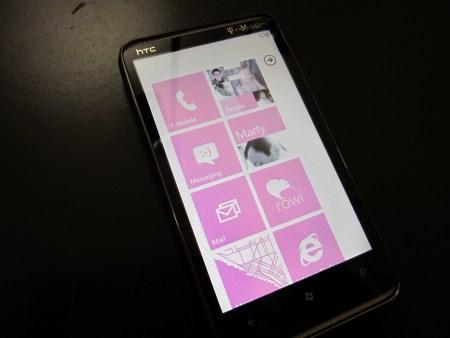
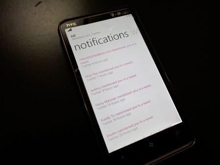
Social: Twitter integration was another feature I was looking forward to. Windows Phone had a problem consistently handling live tile notifications for third-party apps so my Twitter app wouldn't always notify me. Mango has Twitter integration so I can simply pin my 'Me' tile to the homescreen and I'll be notified of new messages. Again, this isn't as great as I had hoped since it only tells you that someone mentioned you, it doesn't actually show you the tweet unless you select it. Selecting a tweet, reading it, going back and selecting another tweet and repeating this process for every mention can be tedious. I've decided to stick to the third-party app I was using.
Camera: 'So, is there anything you DID like about the new update?', you ask. Yes. I'm enjoying the redesigned camera and the fact that you now have the option to simply tap the screen to take a picture. On top of that, Microsoft seems to have fixed a bug in the gallery where pictures wouldn't display correctly. Portrait photos were sometimes sideways or even upside down, no matter how I rotated the phone. This has been fixed. I also now have the option to save my camera settings. By default, the camcorder recorded video in VGA quality, not HD. It was a hassle to switch to HD every time and most of the time I simply forgot to. I don't have to worry about that now.
E-mail: The Linked Inbox feature is also very useful. I have an old Yahoo email account that I rarely use anymore but some of my friends still haven't caught on to using my Gmail account. I didn't like having two live tiles for these two accounts, but it was necessary. Now, I can link my Yahoo, Gmail, and work email into one single inbox with one live tile.
Bing: There are also some improvements to Bing search. When I first switched to Windows Phone, I was blown away by how well Bing functioned. Mango brings even more improvements like Bing Vision (think 'Google Goggles'), Bing Music (similar to services like Shazam), and Quick Cards. With Quick Cards, I can search for a movie I want to see and along with links, Bing will also provide a Quick Card with information about the movie and showtimes for theaters in my area. It will also let me know if I have an app that will assist me in my search. Quick Cards can be used when searching for other things like restaurants, stores, and more.

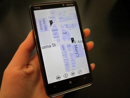
Maps: I'm super excited about indoor maps. Microsoft is one of the first to have this feature and I can't wait until they add support for more malls. It always seems like there's only two maps in a giant mall and I can never find one. With indoor maps, I can pull out my phone, find the mall in Bing Maps, and I can see a layout of the mall and where every store is.
So here is where I'm a little disappointed. Don't get me wrong, Windows Phone is one of the smoothest and quickest operating systems out there and it will only get better. Mango hasn't changed that, which is why it's disappointing. Maybe it's just me but when it comes to speed, everything takes about as long (or short) as it did before. App-loading was never excruciatingly slow in my experience but I had heard people complain about it so I thought Mango would bring improvements. Again, I don't notice a speed up. I've heard bloggers say that with Mango, transitions are smooth with no stuttering. Well, I never had that problem before Mango.
Web browsing was another area that was supposedly super-charged but, so far, it's all about the same. Web browsing in Windows Phone was already fast and pinch-to-zoom could be done with ease. I noticed some places where it could have been zippier, but that was only if I was being very picky. With Mango and Internet Explorer 9, it all runs at the same pace. Granted, "the same pace" is a very quick one, but where are the improvements?
With over 500 new features, it's hard to be disappointed. E-mail conversation view, Quick Cards, image search within Bing, a redesigned camera, linked inboxes, deeper integration with live tiles, to name a few, are some fantastic features to have and I am grateful for all of them. That being said, Mango hasn't quite blown me away the way I thought it would.
I guess I'm so used to Android where every update drastically changes the look of the OS that I, for some reason, expected the same thing with Mango even though I knew that wasn't going to happen. Microsoft had given us plenty of looks at the new version and it all looked the same.
I'm still enjoying Windows Phone. It's as elegant as ever and there are a lot of new features that I'm really excited about. (Check out my Mango video to see some of my favorite new features.) Perhaps I didn't notice any performance improvements, but I also never never noticed a lot of areas that NEEDED improvement. Regardless, Mango is a big step in the right direction and I'm satisfied with it.