Creating a well-rounded, high-end smartphone requires a lot more effort than stitching together a list of top of the line specifications and throwing the latest software on the end product. It requires consideration of the end users' wants and needs, strength and longevity of materials and much, much more. Some cell phone makers have realized this, others have lost sight of what truly matters in light of a specification arms race.
In today's market, time is of the essence and a matter of an extra month or a week (or even days in some cases) can be the difference between a top seller and a flop. Manufacturers have to decide which corners to cut and what features or designs are better on the fly and have little room for error. This on the fly decision making process and loss of true focus has led to a number of popular devices slightly missing the mark. Manufacturers have cut the wrong corners and created devices that lack that extra oomph to push them over the top. Simple things like creaky hardware or a poorly thought out design can ruin a device.
I think the picture says it all – below are the top five things that can ruin a flagship phone for me:

Let me begin by saying that the megapixel rating of a camera, whether it is in a cell phone or a dedicated digital camera, is nothing but a marketing ploy. More megapixels does not mean the camera will take better pictures. If you're not sure what I mean, look here.
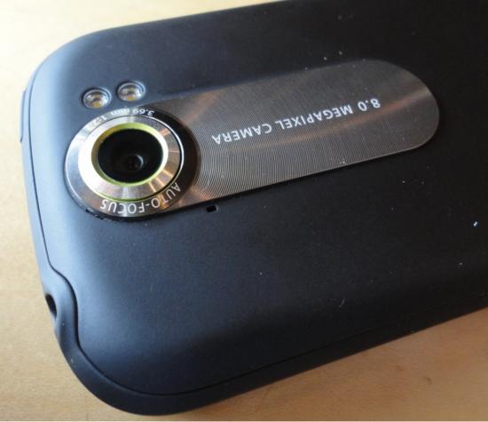
Now that we have that out of the way, I can firmly say that mobile cameras are currently functioning at half capacity. I'm not a photographer or a lens expert – far from it, actually – but cameras in 95 percent of current smartphones were clearly an afterthought. Phones like the myTouch 4G Slide and iPhone 4 are clear evidence of this and are a testament to what a little extra effort in that department can yield. Take the T-Mobile G2x by LG as an example. The camera is rated at 8-megapixels; therefore, one who knew no better would be forced to believe that it comes with a great camera. But that certainly isn't the case. I used the G2x as my personal phone for several months and could not force myself to use the camera. In fact, that's why I no longer use it. Pictures taken with that phone were always washed out, blurry and if the flash ever fired, the white balance was completely thrown off and ruined the picture.
Video recording isn't as important or as big of a problem as stills, and LG isn't the only one to blame here either. There are a handful of other manufacturers who simply can't put together a phone with a decent, consistent camera. Seeing as I use my phone for the vast majority of the pictures I take, I need a phone with a camera I can rely on. To date, the only phone that has never let me down in the image sensor department is the iPhone 4. That said, the next wave of devices are rumored to be coming with advanced lens cameras, so hopefully this will become a problem of the past.
Besides a poor camera, the easiest way for a manufacturer to kill their efforts in the hardware game is to produce a phone with squeaky and loose hardware. I haven't ran across many phones with this problem as of late, but there are certainly a few that have stuck out from the crowd. Keep in mind that by "squeak," I don't necessarily mean it's audible. I mean that if I grip the phone firmly I can feel that the hardware is not exactly tight, or when I depress a button it rubs the button or bezel around it.
The worst "squeak" problem that I've experienced was with the physical buttons on the myTouch 4G. I had three different myTouch 4Gs and after a few weeks, the buttons would start squeaking every time they were depressed. The ThunderBolt's battery door, a plethora of BlackBerry handsets, the Droid X and even my current Nexus S were all victims of the squeaks, too. It's like nails on a chalkboard for me and I will almost always get rid of a phone that squeaks right away – but only if it is blatantly noticeable.

Although the majority of us don't use phones for voice calling anymore, a poor microphone or earpiece speaker gets under my skin quicker than anything. While my mom was using a ThunderBolt, she would call me and it would always sound like she was in a tunnel. Likewise, my friend using his Infuse on AT&T sounds the same. Of course, there are a lot of factors that come into play here: carrier call quality, signal strength, radio software and the combination of the caller's and receiver's speakers and microphones. But this is one area where OEMs have gradually been slipping since the initial smartphone rush. Seeing as a phone's primary feature is still technically calling, manufacturers need to focus more attention on these two aspects.
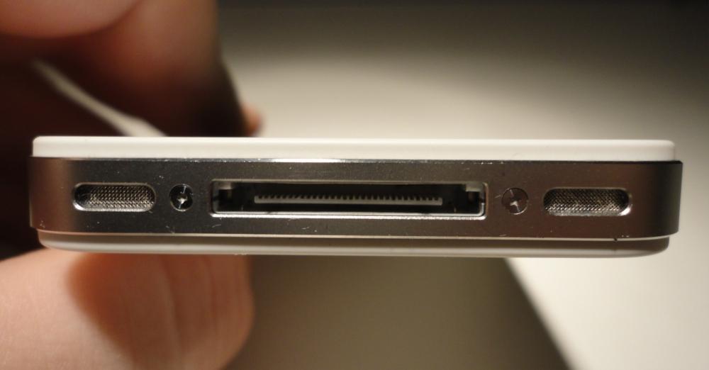
Port and button placement isn't something that has really been a big issue since I was using my BlackBerry Tour, but there have been a select few devices that have slightly bugged me out of the current crop of devices. With the Tour, the microUSB port fell right between my middle and ring fingers on my left hand. It wasn't an issue when just reading or looking at something. But when I needed to use the keyboard, it made me completely change the way I held the device. It wasn't natural and actually made using the phone quite difficult while charging. If the port had been an inch lower, it wouldn't have been an issue at all. As for button placement, the lock button was literally the entire top right edge of the device. The top left edge was the mute button. These buttons were not only squeaky (shudder), they were also extremely easy to push. The phone would constantly come unlocked in my pocket and I would dial or text people at random.
More recently, I have ran into a few road bumps with a handful of devices, most notably, the HTC ThunderBolt. The microUSB port was along the lower left edge of the device – the edge on which the device rested while using the kickstand. Therefore, if you want to listen to music (the speaker is hidden beneath said kickstand) and charge your phone at the same time, it is only possible to do so by standing the phone in portrait mode. In portrait mode, the kickstand is clearly not as stable and the weight of the charging cable alone is enough to pull the device over.
Placement of ports and buttons can entirely change my impression of a device. It's the difference between OEMs using logic and consideration when designing the phone and just slapping some components together and calling it "the next big thing." Personally, I prefer ports and headphone jacks to be on the top and bottom edges of the device while volume and power buttons take the sides. It seems to lead to less issues in the long run. After using the Nexus S (which, in my opinion, has the most ideal button and port placement), it's going to be hard to switch back to something else.

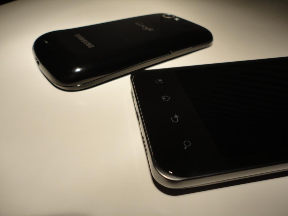
When I hear the words "Jay Leno," the only thing that comes to mind is the T-Mobile G2x. That particular phone has the most awkward looking face of any phone out there. If the "chin" were cut in half, it would be a seriously sleek and sexy device. It isn't necessarily ugly, as is, but that extra long chin just doesn't make sense to me; it's wasted space that makes the device unnecessarily tall. Both Motorola and Samsung are becoming notorious for throwing strangely placed humps in their devices. The Droid X is probably one of the worst, followed by the Nexus S, Galaxy S II, and many others.
The way I see it, if you can't make the entire phone as thin as the thinnest part, don't make the phone that thin. Think your design through a little more and make the thickness uniform – with the exception of a contoured display, of course. An unsightly chin or random hump in the back of the device entirely kills the look of the aesthetics. They may slightly set the phone apart from its cookie cutter-stamped brethren, but I still prefer chin-less, hump-less devices.