The iPhone 5 is hanging over our heads. Coming from our own Today's iPhone, the New York Times has chimed in on the matter again, claiming that "sources familiar with the matter" say it could be launching in the next few weeks, and also that Apple has run into some production problems. The iPhone 5 could be further delayed. We have also heard a slew of different rumors pointing to various dates in late October and November. It's almost impossible to sift through it all and make any sense of it at this point.
Normally, I would have said, "I don't believe anything Apple-related unless Steve Jobs says it while on stage in his Levi's 501s and a turtleneck," by now. But this year is different in so many ways. We're looking to an iPhone launch before Christmas, not during the summer months; Tim Cook is the new Apple CEO; and Apple is finally having to update their flagship to keep up with the competition.
One of said updates is believed to be coming in the form of a larger display, which will also yield a larger (wider) device. This, we assume, has made Apple completely redesign the phone. At first we didn't believe Apple would be totally changing the design, and in fact, I'm still having trouble accepting the fact that they're scrapping all efforts on the integrated antenna design. Nonetheless, all fingers are pointing to a new design in the iPhone 5 and rumored cheaper solution, the iPhone 4S, will retain the iPhone 4 design.
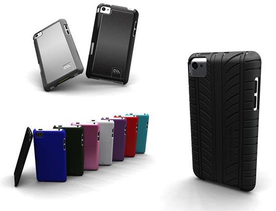
As per usual before an Apple product launch, there have been hundreds of imaginative design concepts to grace the Internet – some a little more far-fetched than others. But Case-Mate, a popular cell phone case maker, may have removed all doubt about the design change and what it may look like single-handed. They have updated their website, seemingly outing the new iPhone 5 design.
As you can see pictured above, the purported iPhone 5 design strongly resembles that of an iPod Touch. Ew. I'm aware that many love this design; it's lighter, thinner and obviously touts a larger display than previous models. And the change makes sense in a way; all of Apple's portables (the iPad 2, iPod Touch and soon to be iPhone 5) will sport a very similar design. But I have stated many times before that there is a point where handhelds become too thin. After a device becomes so slender, it becomes unwieldy and difficult to get a good grip on without the use of a case. I hate cases.
Not only that, but in my review of the iPad 2, there were some significant changes in the design that made me prefer my original iPad over the second generation. The beveled edge, instead of having a solid, flat edge, makes the power and volume buttons wrap around to the back and stick out at an odd angle. On the original iPad and iPhone, you can certainly feel the buttons if you run a finger along the edge, and that's good. But on the iPad 2, the buttons snag your finger. They're sharp and unsightly.

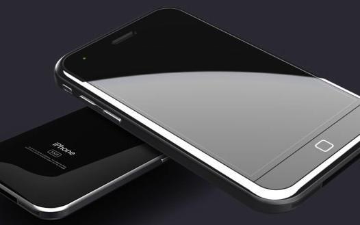
I've been following all of the concepts pretty closely since the first one came to the limelight. Of all of the different renders I've seen, the one pictured above is the by far the best and more along the lines of what I was hoping the iPhone 5 would look like. That said, I don't think Apple will be fitting any iPhone with a notification LED.
There is still hope that the design shown by case manufacturers isn't exactly right, but the chances of a company like Case-Mate jumping the gun and wasting valuable time and resources on something they're unsure of are low. Fortunately, we only have a few weeks left to wait until we know for sure. And who knows, maybe I'll like the finished product. But based on what I've seen, I'm not a fan.
What about you ladies and gents? Do you like the iPod Touch-like iPhone 5 design? Or do you think it will make Apple's flagship lost a bit of luster with its weight loss? Is there a different concept that you like more? Sound off below!
Image via Today's iPhone