The original Galaxy Tab was the first high-end Android tablet to make it to shelves. At the time, it was running the latest version of Android, version 2.2. Google had publicly announced that Froyo was not optimized for tablets and many manufacturers decided to hold off until Honeycomb arrived. Samsung, however, decided to go ahead release the Tab and also to skin it with a modified version of their somewhat popular TouchWiz UI.
Back when I had a Tab, I rather enjoyed TouchWiz solely because it added some nice widgets to the mix and did a pretty good job of masking the fact that Froyo wasn't optimized for larger displays.
Since then, Honeycomb has landed on retail shelves and shown us all what Google is capable of. They have finally polished off Android on their own and alleviated the need for a custom UI to simplify things.
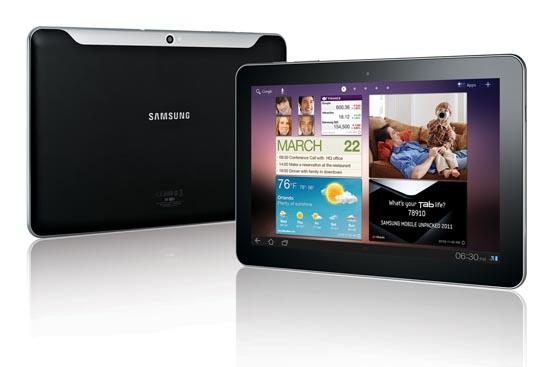
Earlier this morning, Samsung announced both the Tab 8.9 and 10.1 with some pretty impressive specs in tow. They are 1.03 pounds and 1.39 respectively and both are 8.6mm thin, which is 0.2 slimmer than the amazingly thin iPad 2. Save for display size and battery capacities (6000mAh for the 8.9 and 6860mAh for the 10.1), the two devices come with the exact same specifications: 1GHz Tegra 2 dual-core processor, 2-megapixel FFC and a 3-megapixel rear camera with LED flash, and 1280 by 800 resolution displays. And they will ship with Android 3.0, of course.
Along with the announcement of the tablets this morning, Samsung also introduced TouchWiz UX (User Experience) that will come skinned over Honeycomb. I've never really been a fan of TouchWiz, so I instantly cringed when I read that these tablets would ship with a modified version of it.
After piecing a few things together though, I realized that it may not be as bad as I first thought. Samsung's TouchWiz UX description begins with:
“Samsung’s TouchWiz user experience is designed with a Live Panel menu users can customize to display a variety of content on the home screen including digital pictures, favorite Web sites and social network feeds.”
Perosnally, I'd preder stock Honeycomb over TouchWiz UI aspects. Luckily, this tablet version of TouchWiz has a unique feature that makes it more of an experience versus a simple custom interface. The second half of Samsung's description reads:
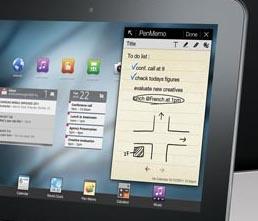
“In addition, the interface includes an application tray of commonly used features such as task manager, calendar and music player which can be launched while other major applications are also in use, including large file downloads and document editing. This Mini Apps Tray provides a mixture of convenience and flexibility previously unheard of with tablet device.”

The Mini Apps Tray, at first glance, sounds like a tweak of Honeycomb's native task switcher. But these are actually separate applications that launch over a currently running application as you can see pictured above. The memo application launches over the home screen and takes up less than a third of the display. From my understanding, you will never have to leave an application to add something to your calendar, change the music you're listening to, etc.
The whole point of Honeycomb was to bring a more desktop-like experience to tablets. The Mini Apps Tray does just that and can be useful in many ways. It only furthers the usability and functionality of tablets.
I know not everyone is going to like the idea of a custom UI over Honeycomb, but the alterations appear to be minimal. Plus, the Mini Apps Tray sounds like a nice feature to have. It's actually enough to make me consider one of these bad boys over a Wi-Fi only XOOM, which should say a lot. Do you like the sound of TouchWiz UX? Or would you just prefer stock Honeycomb on your tablet?