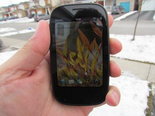
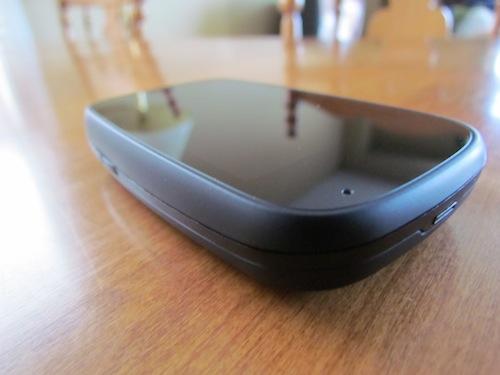
The Palm Pre 2 has a Gorilla Glass screen that is flat, compared to the previous versions having curved plastic. It’s 3.1 inches, TFT, and has a resolution of 320x480. The top of the phone has the power button, silencing switch and 3.5mm headphone jack. The left side had a volume up and down button.
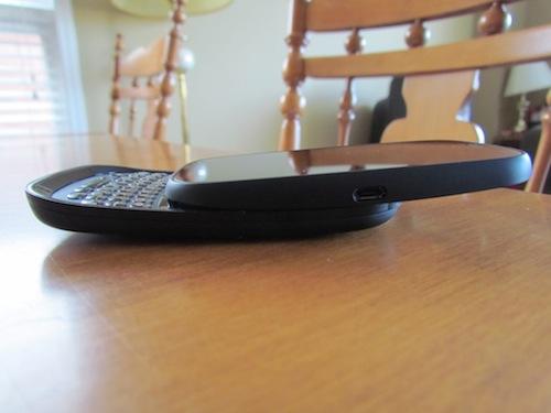
One small note is that there is no longer a cover for the MicroUSB port. The previous one was a bit of a pain to open so Palm has just done away with it. It’s still located in the same place on the right side of the phone. The 5-megapixel camera is located on the back and can shoot video at 640x480. There is a flash for use with still shots.
While it looks very similar to the original Pre and the Pre Plus there are minor differences in the look of this phone. The screen on the Pre 2 is a welcome change and will certainly withstand a lot more abuse than the plastic screens. It’s a relatively small 3.1-inches, which is the same at the older models. While some may feel that’s small, it seems to work very well on this phone and with webOS in general. The screen is very bright and colours show reasonably well indoors. Outdoors you would be amazed at how clearly you can see the screen (my picture doesn’t do it justice). If you spend a lot of time outdoors you will appreciate this screen greatly! The resolution is also fairly low (320x480) but that’s never bothered me. HP webOS does an excellent job of making everything very readable.
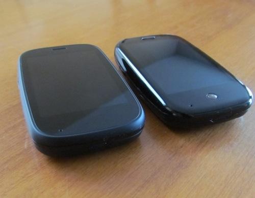
The original Pre had a smooth plastic body which didn’t just show every finger print but actually made the Pre feel like it would squirt out of your hands like a bar of soap. The Pre Plus improved on that by coming with the Touchstone backing which had a more rubberized feel. On the Pre 2 the whole phone has this rubberized feel, and while it may not look as pretty in glossy press photos, it's a great improvement for users. The rubberized body even comes right up the side of the screen to create a small lip or bezel around it. This actually allows you to put the phone face-down without the screen actually touching the surface.
The keyboard really hasn’t changed from the Pre Plus. I wish it actually had more of the feel of the Palm Pixi keyboard, which is more “clicky” but maybe I’m in the minority there. Either way, it’s certainly serviceable. The keys are very close together, which some may find off-putting but it does an excellent job of recognizing the correct key press during use. It may take getting used to for some but it will work well, even for beefier fingers.
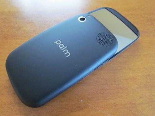
When I got my original Pre I was very surprised at how well the 3MP camera worked. As I said earlier, the Pre 2 now has a 5MP camera and does just as well, but with a few more pixels. Images look great from this camera! It would be nice if there were more options but being consistent with the rest of the UI, it’s simpleness just works. There is a flash that works quite well, but only if you are fairly close to your subject. Video is limited to 640x480 but is very sharp with no stuttering at all. There is no hardware camera button, by the way; you will have to use the software shutter button. The Pre 2 retains the mirror on the back of the phone for help with taking self portraits...or for checking between your teeth before your date.
I know a lot of you would want to wait for different hardware to even consider a webOS device and I don’t blame you. I’d love to see a slim, large screened webOS phone as well but the Pre 2 does an excellent job for what it is. Looking at webOS, I occasionally feel like it is too...cartoonish, if that makes sense. It’s a great OS but looks like it’s made for a younger audience. Nothing wrong with that but perhaps that will keep many from taking it as seriously as it deserves.
The Pre 2 is a nice refresh of the line but it is mostly going to appeal to current Pre owners, meaning no net-new customers. Perhaps that’s all Palm is looking for right now, but they do need to follow up with new and interesting hardware. If you like the form factor, you will love the Palm Pre 2. I’m going to be sorry to see this review unit go back, but such is the sad existence of reviewers. Phones come into our lives, we love and care for them but eventually we...ok, enough of that. Sorry.
The Palm Pre 2 is available in Canada from Rogers Wireless now for $99 on a 3 year (yes, three year!) contract or for $449 outright. In the US the Pre 2 can be had from Palm directly, unlocked for use on AT&T for $449. It's expected to come to Verizon Wireless in the near future.
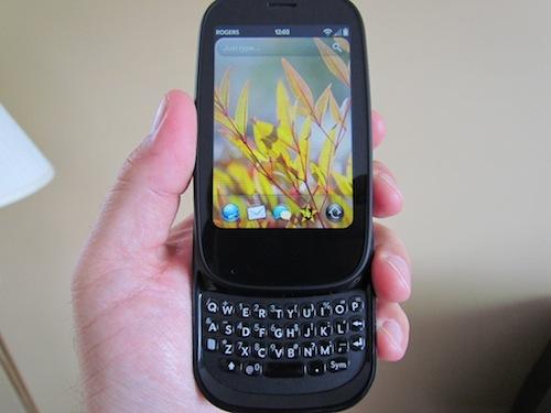
What’s Good: Fits nicely in the hand; improved camera; improved battery life; 1GHz processor; rubberized feel. HP webOS 2.0 brings many welcome changes.
What’s Bad: Very similar to older models; small keyboard; not very slim; slider still wobbles.
The Verdict: If you didn’t like the form of the previous Pres you won’t like this one but if you are a fan it offers improvements on almost everything. It’s a welcome and worthy successor but not a crucial update for current owners.