Who doesn't love a little frozen yogurt? While our own Nate Allen may enjoy Costco's froyo more, you and I are all much more interested in the less edible kind. Android 2.2, or Froyo, is a huge update for Google's market-sweeping operating system. While it may not look very different to the untrained eye, it definitely has some underlying changes that really make a difference when you begin to use it.
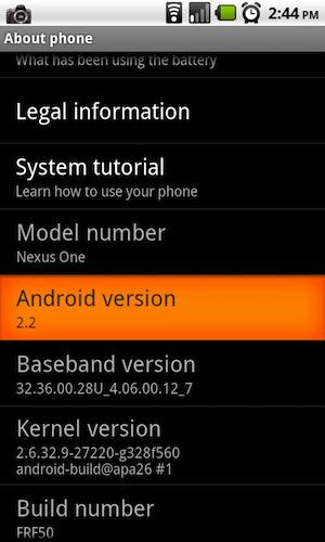
If you follow my Twitter feed (@BBCasper), you will know that I've been flaunting my Froyo for roughly three days. Google announced Froyo at their I/O conference last week on May 20th, and started rolling Froyo out to review devices on the 22nd. Since the Nexus One is now the “Google” phone and does not have any direct ties the supporting carrier, when Google releases Android 2.2 officially (to the public, not review devices), the OTA updates will go directly to the devices. Of course, until that time, the wonderful hackers of the Android world have graced us with a rooted version of Froyo to help calm the impatient masses.

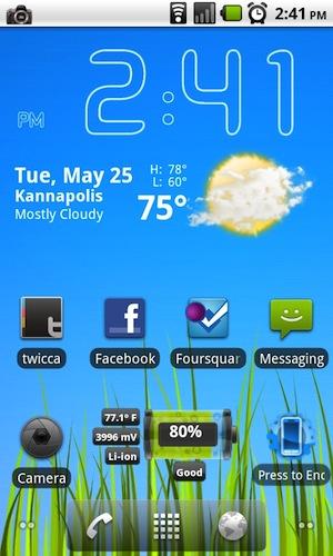
The first thing you will notice when you upgrade to Android 2.2 is the modified home screen. Before there was solely a square icon at the bottom of the screen for the application drawer. Now on the left of the icon is a phone icon, to the right is a browser icon, and to the far left and far right of the screen you will see a marker that shows what screen you are currently on. Personally, I love this setup. Before, if you wanted quick access to the browser and/or phone on your home screen, you would have to setup some icons on your home screen. This modification more efficiently uses the home screen and makes some of the more commonly used features of the phone more quickly accessible.

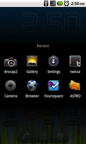
Another thing that you might notice that looks a little different is the most recent tasks page. Prior to the 2.2 update, when you long press on the home button of your Android device, the last six applications you have used will appear in the middle of the screen as shown below. With froyo, they have changed this page from six to eight of the most recently used applications. Honestly, between six and eight applications I don't care, but it is a change nonetheless. These minor changes plus the addition of a Market widget are essentially all of the visual changes in Froyo, but the real changes lie underneath, hidden within the settings and within a few applications that need to be downloaded.
Possibly the most anticipated update brought in Froyo is (nearly) full flash support. In Android Market, you will see the newly available download for Flash Player 10.1 BETA. I must say, it works exactly like it should. Mind you, it is still in the BETA phase and does have some minor issues, most websites that run any standard flash will render quite well on my Nexus. Sites like Hulu are quirky, complicated, and different. They will not work yet, unfortunately. In all honesty, flash is very important to me; I don't plan on watching any flash videos within my browser. It is very cool to have and a nice bell or whistle (whichever you consider it to be), but it is not a make-or-break factor to me. For many, it is, and I'm glad to see the Android development team working with Adobe to make it happen.

The other long-awaited update found in Android 2.2 is the built-in wireless and wired tethering, a carrier's nightmare. Being on an unsubsidized device, there isn't a lot AT&T or T-Mobile can do to the Nexus One updates. When other phones such as the Motorola Droid or the HTC Desire get this update, the carrier will more than likely remove that feature and try to force you to pay their $30/month (it may vary) tethering fee. For those of you that load custom ROMs onto your device, you will likely see this in the various ROMs that will soon flood the Android forums. I've been using both wired and wireless tethering for some time now, and it is definitely a cool feature to have. It's nice for those emergency situations that you may need internet on your computer, or when you're in the middle of an online quiz for one of your classes and your home internet goes out; not that I would know anything about that.

Undoubtedly, my favorite function of Android 2.2 is the ability to move your installed applications to your SD card. As of right now, there is no support for this within the applications. For the impatient (me), there is a workaround to enable this feature, which I took the liberty of doing to my phone. I will include some information about that if you are interested in it at the bottom of this review. The official version will require the developer to decide whether they want to allow the installation of their application on the SD card or not. In a way this is good and in another, just as bad. It can help the prevention of the piracy of paid applications (along with some encryption I read about), and some applications simply will not work from the SD card. What I have found from manually enabling the moving of applications to the SD card is that any application that has a widget will not work if installed to the SD card. Initially, the widget will work until you mount your phone to your computer, or unmount the SD from the phone. At that point, you will have to reinstall the application again before you will be able to add the widget back to your home screen. Hopefully this will not be the case when the developers enable the SD card support, but for now I can live with my widgets and applications containing widgets being saved to internal memory.

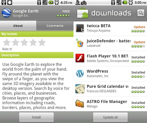
Within the Market application, there have been some tiny improvements, but they go miles in my book. The first thing that you will notice upon viewing application details in Market is that the comments are no longer visible in the initial application about page. There are now two tabs at the top of the page, “About” and “Comments.” I love the separation as it is now much easier to view more comments on an application and everything is just ever-so-slightly more organized. The next major update to Market is the ability to update all applications at once. Rather than updating each individual app at a time, you can now press “Update all” at the bottom of the Downloads page to quickly update all applications that need updating. Before, you would have to click on each application, select “Update”, then select “Ok” just to update one app. That got to be very frustrating considering how often Android developers update their applications.

From what I can tell, the changes to the Car Home app are nothing beyond aesthetics. Although, nothing major has changed, Car Home is now very slick looking, and much easier to use. Bigger buttons make for easier use while in the car, and the way it works flows more like Android than it did before. It used to be a curved line flowing across the screen in a fancy layout. Now, it's much more simple, but looks heaps better, and you have two screens that you can slide between, but like your home screen. Also, if I do recall correctly, the old version of the Car Home acted more like an application. This new version is more like a temporary home replacement for in-car use. When you press the home key, it takes you back to Car Home. Before, (this is where I could be wrong because I rarely used it) I believe it took you back to your home screen.

Another intuitive change is the call log. Before, the call log would list every call you made or received, one after another. The change was rather smart in a “save screen space” kind of way. Now, the calls are grouped by contact and day. Although, it may be a tiny change, it was the little, insignificant details that turned me into a BlackBerry fiend. I'm glad to see that Android is now starting to focus on the little things and refine their gold mine of an OS.

Along with all of the major updates, there are some minor changes that have been made within the general settings in 2.2. One of these more minor changes is the ability to better customize when you want to enable/disable vibrate. You now have the options to enable it always, never, only in silent mode, and only when not in silent mode. Also, you have more options for passwords now as well. Rather than just pattern lock and you have the choice between a pin, a alpha-numerical password, and a pattern lock. There are also some other changes that have been made in the security department, but I'm not fully aware of their significance. Again, these are all part of the tiny details that refine an OS and make it more and more reliable for the end user.
Rather than dragging this out any further and putting everyone to sleep, I will get straight to the point. Froyo is exactly what Android needed. They were already climbing the ladder to the top of the cell phone industry, and Froyo is just another rung in that ladder. It tells us that the Android development team is focused on what matters and is heading in the right direction. I've been using Sense UI on my Nexus and the stock ROM (rooted) for a while now. I loved them both, but after using Froyo, I will not be looking back anytime soon. It is lightning fast, more reliable, and overall more refined.
Even the multi-touch is more reliable. I've been using the Swype alternative keyboard since I got my Nexus One. After updating to Froyo, I installed Swype again, but have ultimately been using the stock Android keyboard. It seems to be much more accurate and easier to type with that what I can remember.
With huge upgrades like Flash support, built-in tethering options, and application storage on external memory, Android has swept the carpet out from under the competition. Mind you, the carriers are not going to be too accepting of the tethering options, it does show us that Google has a more consumer-friendly mindset than carrier-friendly, which is amazing.
So far I have only encountered three tiny handicaps to Froyo. First and foremost, no application support for the application storage on the SD is a little disheartneing. I'm aware that it is coming, but like I said before, I am impatient. When it does finally make it to my Nexus, I hope the widget issue will be resolved. The second drawback is definitely the open availability of one of greatest features of 2.2 being restricted by carriers. Meaning, only people with an unsubsidized Android phone (Nexus One) will get to reap the full benefits of Froyo. For everyone else with a carrier branded device, those carriers will play their cards and bully the customers like they're known for doing. Last, some applications seem to not want to work with 2.2. This is nothing more than a developer updating their application, but it was a tiny little hiccup that got on my nerves. At least when all the developers do update, I can update all of my applications at once. :-D
One thing to expect is that if you do not have a Nexus One, your version of Android 2.2 will be slightly changed by each carrier. The Motorola Droid will probably (don't hold me to this) keep its stock app drawer since it didn't get the cubed one with its 2.1 update. Hopefully minor things like that won't ruin your day when your 2.2 update does finally come. We all hope 2.2 comes sooner rather than later, and rolls out much more quickly than 2.1 did is.
If you want a hands-on look at Froyo, you should head on over Andrew's (from DroidDog) YouTube channel for his three part series on Froyo. Acsteffy87's YouTube channel can be found here.
If you were one of the ones interested in manually enabling application storage on your SD card here are the two ways to do it.
(Note: PhoneDog is not responsible for any damages you may incur to your phone during this process. Only do this if you know what you are doing.)
1. Using a computer:
2. Using a Terminal Emulator on your phone: (Must be rooted)
3. To disable the application installation to SD card repeat the process but exchange the 2 with a 1.