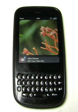
I love Palm's WebOS. I ultimately shied away from making the Palm Pre my daily phone, however, because I didn't much like its form factor. I'm not a big fan of slider phones, instead preferring thinner candybar devices even if they wind up having a larger footprint. I also couldn't stand Pre's QWERTY board and took issue with sharp edges that bordered the keyboard tray (even though my colleagues still think I'm crazy for that one). But I loved WebOS and still do. As MobileCrunch's Greg Kumparak put it:
It pulls off a polished feel without resorting to absolute minimalism as the iPhone does, and handles notifications and switching between applications in a way more elegant and effective than Android. Palm is the only one of the lot to find the perfect combination of form and function.
Couldn't agree more, Greg.
I'm not going to go into depth about WebOS here, since it's essentially the same as it was on the Pre some months ago - plus some bug fixes, feature upgrades (Yahoo! support and 3G downloading of purchased music, notably), and a few hundred more apps in the Catalog. Suffice it to say that I think WebOS is the best mobile OS going, even if it lacks the developer and carrier support right now to make it the best mobile platform going. That is, the core OS itself is state-of-the-art, but more apps running on more devices across more carriers would make WebOS a much more viable platform for competing with iPhone, Android, and the rest of 'em.
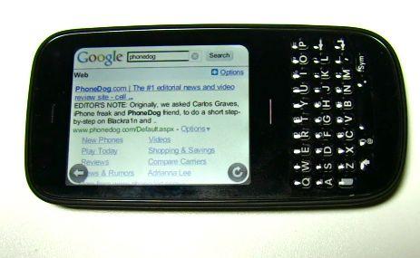
Some months ago word broke that Palm's second WebOS device would have a candybar form factor with a thin profile and front-facing touchscreen and QWERTY. My dream come true! So I've been anticipating that phone - the newly released Pixi for Sprint - for awhile now. Palm sent me a review loaner last Friday and after a weekend with the thing I can tell you that I absolutely love the form factor. Love, love, love it. Love it like it may be the nicest feeling phone I've held in my hand since phones got all big and Web-enabled and smartphone-y.
Pixi suffers from a lack of WiFi and processing power, but Palm absolutely nailed it in the form factor department. The phone is insanely light and pleasant to hold, and despite being made from all kinds of plastic it feels solid enough in a space-age way, not cheap or flimsy as plastic phones often do. The phone feels good during calls (which so far sound so good out here in the Bay Area on Sprint's network), and feels pretty good during one or two-handed use, even in my large, uber-manly mitts.
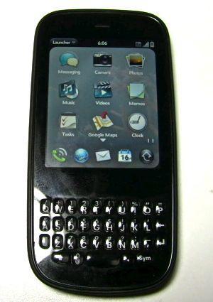
While Pixi's 2.63" capacative touch display is much smaller than Pre's, WebOS was made to resize to fit different resolutions, and it looks great on Pixi's 320 x 400 screen. Reading Emails and Web browsing was fine on Pixi, in part due to the OS' excellent double tap and pinch-to-zoom methods for resizing text and Web pages. I will, however, admit to basking in the extra real estate when I switched from the Palm to iPhone or Droid with their massive 3.5" and 3.7" (respectively) displays. Pixi ain't no giant touchscreen phone, but it's amazing how quickly I got used to it all the same.
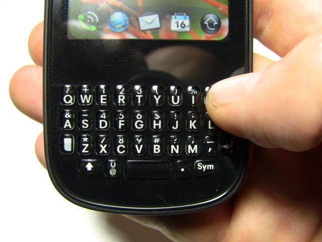
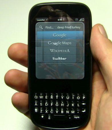
I really feared Pixi's keyboard after suffering such disappointment with Pre's curved rows of tiny little domed QWERTY buttons. Pixi really surprised me, however, by being far more usable than its big brother when it came to tapping out IMs and Emails with my thumbs. Credit Palm for redesigning Pixi's QWERTY using slightly taller/skinnier buttons and giving them a much more satisfying click action than Pre's. Palm also ditched the Pre's curved rows in favor of a straight grid array of buttons, and I personally like that the QWERTY resides on a flat plane as opposed to Pre's somewhat recessed keyboard. Whatever the magic is that transpired between Pre's debut and Pixi's design, it added up to far more accurate, comfortable typing - at least for me.
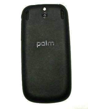
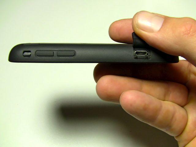
Pixi's backside is also quite nice, what with its matte black soft-grip plastic, inset mesh stereo speaker grilles, and understated camera sensor and flash. The inclusion of an iPhone-style hardware mute switch is a nice touch, and the 3.5mm headphone jack is, of course, appreciated. I didn't dig the somewhat hard to press lock/power button or the fussy, magnetically latched micro-USB port cover so much, but neither is a deal-breaker.
And did I mention how thin and light Pixi is? Combine that with the phone's tall and skinny footprint and you've got an insanely pocketable device. Seriously, this thing has me rethinking my whole "Giant touchscreen phones are awesome!" state of mind. There's something to be said for lots of function packed into the tiniest package possible so long as it's still usable.
Speaking of usability, Pixi's faults lie not on its surface but inside that sexy little body. WebOS lags on this device, and while Sprint's EV-DO network generally offers solid 3G data speeds, there's no reason not to arm a smartphone with WiFI in this day and age. As such, the overall experience of using that beautiful, functional operating system is a bit less Zen-like than it is on the zippier Pre. Apps take a noticeably long time to launch, cards sometimes hang in mid-swipe, and Web pages are given to momentary freezes during render.
Pixi isn't so slow as to be unusable. But Pre users in search of a different form factor and smartphone nerds wanting a taste of WebOS will surely notice (and scoff) at the performance hits brought on by the cost-saving processor Palm wedged into this device. While WebOS is made for multitasking, Pixi itself is more made for sending a message while your Web page is still open - multitasking Lite, if you will.
I haven't done much with Pixi's camera yet, but I can tell you it's a 2 megapixel w/flash affair. On the one hand, that's 1.2 MP less than Pre. On the other hand, if you haven't learned by now that megapixel count alone tells you almost nothing about a cameraphone's photo taking abilities, well, you should learn it already. It's true.
Palm makes no bones about Pre's place in the market, however. They're aiming it at users who want a messaging phone with a little bit extra going for it, not for the full-on smartphone user at whom Pre is aimed. For most people that's fine, though again I can't forgive the lack of WiFi (especially when iPhone 3G, HTC Hero, and HTC Droid Eris all pack WiFi at the same $99 price point).
I'm not most people, though, what with my insanely quirky and refined tastes in smartphones. What I really want is a Pixi with Pre's speed. Instead I'm left with a choice - Pre's form factor (which I don't much like), Pixi's performance issues (and lack of WiFi), or a device that doesn't run WebOS. Decisions, decisions, huh?
I think I may wind up waiting to see if rumors of a slightly larger, higher-powered Pixi offshoot start kicking around any time soon. Doubtful, I know, but at least I've got a Pixi to play with for a few more weeks in the meantime But I feel like Pixi is a compromise, and with Pres readily had for under $100 with contract via various online retailers, Pixi's $99 price tag (via Sprint) isn't much of a reason to pass up the more powerful Pre. If you're in the market for a WebOS phone, it looks like the choice will come down to a thinner phone with a better keyboard (Pixi) or a phone with a larger display that performs markedly better all around (Pre). I'll chime in with some more thoughts on Pixi after a bit more testing.