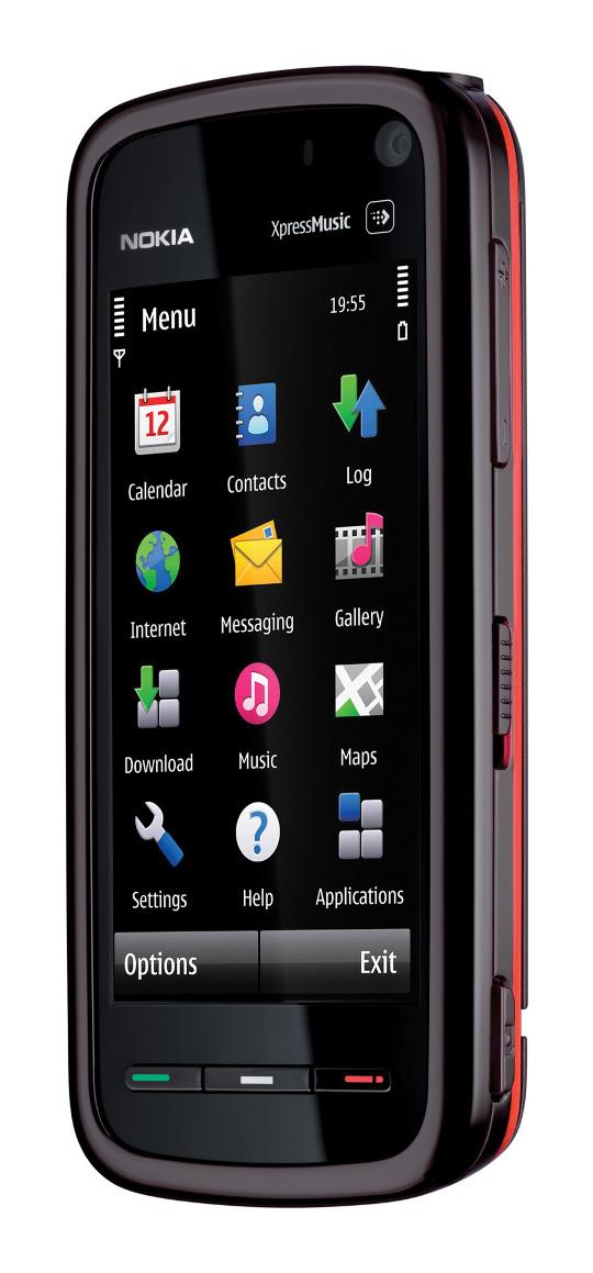
What's good: form-factor looks nice, fantastic in-line music controls, 3G (AT&T only for US), secondary camera for video calls, full touch screen, landscape mode, proximity sensor, Carl Zeiss optics, Flash support, music player, good video playback, and the 3.5mm output pumps out audio and video. Also integrates with the Ovi store which offers usable content to users on various continents.
What's bad: the resistive screen could be more sensitive, the UI is a bit unintuitive and cumbersome, the OS feels like a slightly modified feature phone operating system rather than a touchscreen OS - which is exactly the case. This caused me to shy away from some of the key features.
The Tube, as it was called before release, is a slick looking phone. Noah's hands-on at MWC in Barcelona will give you a good idea of the interface. It's geared towards media hounds, and has a nifty dedicated spot on the screen for launching the media menu. This is Nokia's first full-face touchscreen device, and in kinda shows. S60, the phone's operating system, was written for non-touchscreen phones. The software functions fine in the 5800, but there are some vivid reminders of S60's origins tucked away in the UI. Those are the elements I would consider detractors. But if music is your thing over menus, this one deserves a look.
I got the black version of the phone, but there are red and blue varieties available. The colors are found in an accent strip that wraps around the device, and in the home screen menus. The back features a sort of rubbery black material with a slightly glittery soundwave graphic. The front is glossy with three hard buttons. It's not big, but it's not small - average in size.
The phone has a nice music player with manual equalizer controls. The browser is more capable than that of many feature phones, but remember, it still is a feature phone - though it sits at the high end. There is a 3.2MP cam capable of good pictures and decent video. See the full specs at Nokia's 5800 spec page.

I'll start with the good stuff here. First off, your activities are separated for each contact. If you want to look at the call history between you and your spouse, or just the SMS conversations you've had with your best friend, than this phone has you covered. Each contact entry also has a spot designated for avideo call number. Good thinking, Nokia.I like the secondary camera, even though I only used it for a test. Thefact that Nokia is looking at video calling as a current standard to bemet is encouraging.
The media functions on the 5800 are great. Not at the level of say, the iPhone, but you are getting a capable player when you buy the tube. The only limitation here is the UI, which is my sole real beef with the Tube. Some items in a list must be double-tapped to be activated. Combine this with what I think of as an insensitive screen and you run into frustration (I spend my time with a G1 and iPod, so it's not a fair comparison - those are capacitive screens).
Another issue is the scrolling. There is no flicking through menus here - you grab the scroll bar and draw it down if you want to proceed through a list. This is fine, and I'm sure I could adapt. But for anyone coming from the iPhone, G1, or other modern touch screen, will probably feel that something is missing.
When I type an SMS to a number that is not in my contacts, I practically have to crush the squishy screen in order to select the field where I type in the number. This has become more annoying over time, where other issues have bothered me less and less. The typing is O.K. - I would like to see some kind of corrections, auto-punctuation, and whatnot. But like I said, my standard references don't apply here. Once you've been on a smartphone for a while, it's difficult to let go of the goodies.
The more time I spent with the phone, the more I like it. I think the UI could certainly be improved upon, as it put me off from a few features. Fumbling through the camera interface is one example of a situation where I gave up pretty quickly and missed out on some powerful functions. I dove back in, but beware before buying so you won't have remorse. I think getting over (or getting adjusted to) the interface will go a long way in customer satisfaction.
Also see Nokia's product page, Noah's unboxing, and Noah's review: part 1, part 2, and part 3.