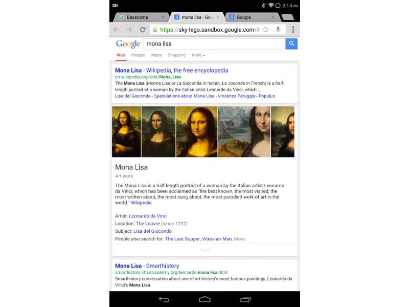
Typically when we highlight Google updates, we’re talking about a refresh of one of its apps for Android, iOS or some other platform. Today’s a little different, though, as Google is testing a redesign of its mobile web search results.
Dubbed “LEGO,” the new user experience offers a much better looking, smoother search experience. As you can see in the demo video below, the search results now appear with a smooth animation rather than just popping in. A similar animation is used when selecting a knowledge graph card, and when in that card, users are able to scroll through the image results.
Right now there’s not much known about LEGO outside of what we can glean from this demo. The redesign is definitely much more visually appealing that Google’s current search results, though, so hopefully we’ll eventually see it roll out to the public.
If you’d like to give LEGO a try before its official rollout, you can try visiting this link from a mobile device. I was unable to access it, getting a 502 error rather than a Google search page, but you may get a chance to play with LEGO if you’re lucky.
What do you think of this LEGO search redesign?