Google Pay is getting a new design that's starting to roll out widely today.
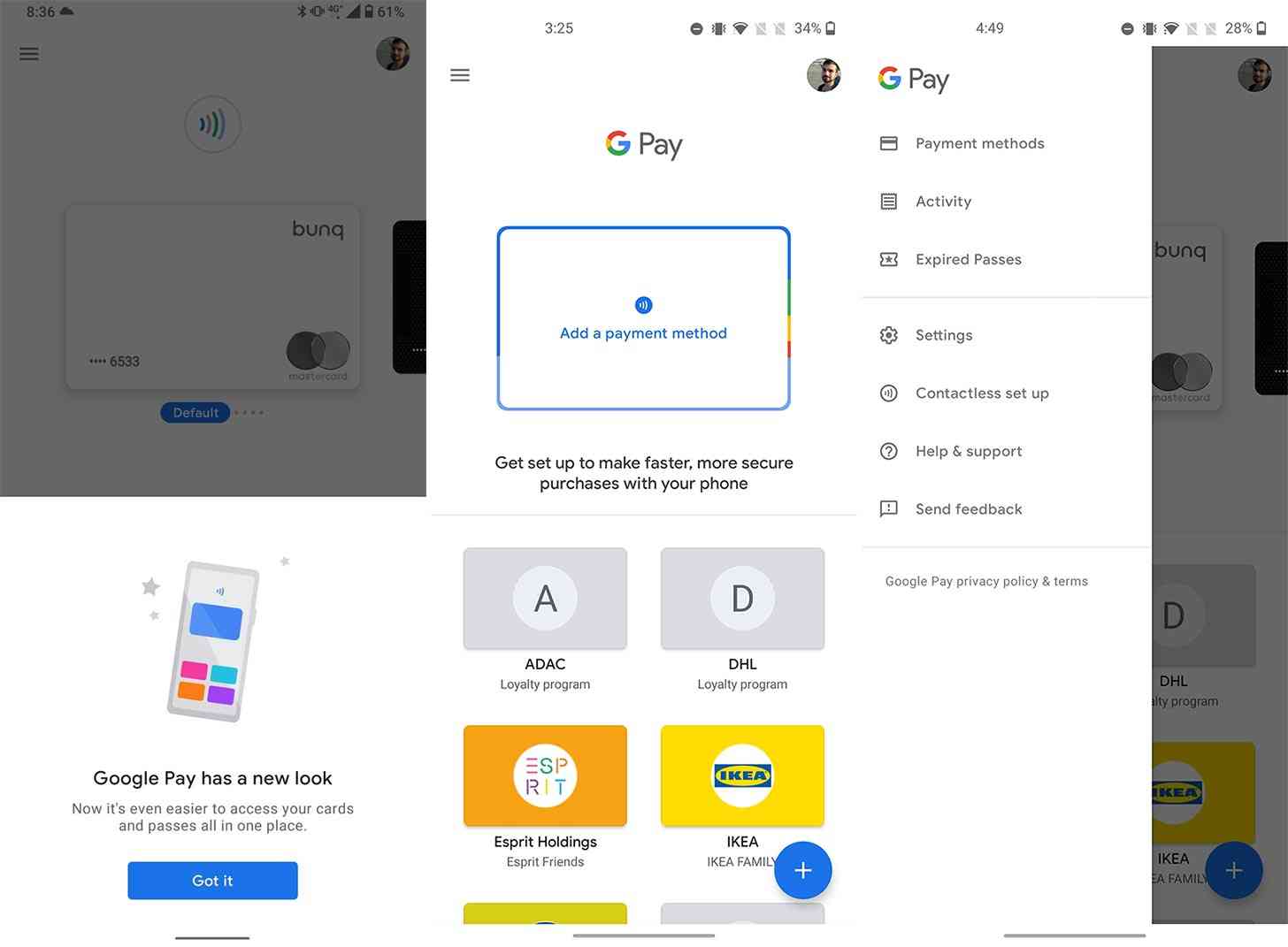
The new-look Google Pay ditches the bottom tab and instead has all of its navigation in the slide-out hamburger menu (via Android Police). In that menu, you'll find shortcuts to view your activity, set up contactless payments, re-order your payment cards, access settings, and more.
On the main screen you'll see a carousel of your payment methods and a scrollable list of your loyalty cards below it. There's a floating action button in the lower right corner that'll let you add new payment and loyalty cards, gift cards, and transit tickets.

This updated version of Google Pay appears to have started rolling out widely, so if you don't have it yet, it should hit your phone soon. When it does, you'll get a pop-up telling you that "Google Pay has a new look" when you start the app up.
The new Google Pay design looks good, with the decision to ditch the bottom tab and move all the navigation to the slide-out menu giving the app a cleaner look. Let us know when you see this new-look Google Pay on your phone!