
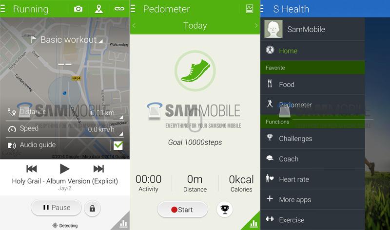
Over the past month or so, several screenshots have leaked that show that Samsung may be prepping a new version of its custom TouchWiz user interface that's flatter and less cartoony than the overlay that we're accustomed to. Following last week's leak of Samsung's new Life Times and S Voice apps, today some more images have surfaced that show off an updated version of the company's S Health app that also features a flatter UI.
This revised version of the S Health app features a green color scheme similar to the one used by the current version of the app, but there are also quite a few differences between the two pieces of software. For example, the hamburger button in the upper left corner of the display, the icons have had their drop shadows removed and there's a lighter font used throughout the updated S Health app. One new feature that's been added is the ability to view your location on a map, view distance and speed and also control audio playback all from the same screen.
Samsung has gotten quite a bit of flak for TouchWiz over the years from critics that say that it's too heavy and cartoonish. It appears that the company may finally be taking the criticisms to heart and giving its custom user interface a makeover, and from what we've seen of it so far, I'd say that the changes look pretty good. The app looks like it more closely adhere's to Google's design language for Android, which is sure to please many of the TouchWiz detractors out there.
It's worth noting that Samsung is said to be currently testing this new UI, so there's no guarantee that the retooled UI and these updated apps will make it to market. Considering these leaks as well as the news that Samsung has struck a deal with Google to tone down its custom overlay and place more of a focus on Google's apps, though, I've got a feeling that Samsung's upcoming product launches might end up garnering even more attention than normal.
Via SamMobile
- Log in to post comments